ShopDreamUp AI ArtDreamUp

Deviation Actions


Suggested Deviants


Suggested Collections
![Welcome to Mario Kart! [Blender]](https://images-wixmp-ed30a86b8c4ca887773594c2.wixmp.com/f/19713941-e4e9-49dd-91d8-c6cf027cd4c9/degy7px-aabf4af6-e8cb-4c8f-93a1-2c1479f7f4a5.png/v1/crop/w_184,h_184,x_36,y_0,scl_0.17037037037037,q_70,strp/welcome_to_mario_kart___blender__by_paraspikey_degy7px-92s-2x.jpg?token=eyJ0eXAiOiJKV1QiLCJhbGciOiJIUzI1NiJ9.eyJzdWIiOiJ1cm46YXBwOjdlMGQxODg5ODIyNjQzNzNhNWYwZDQxNWVhMGQyNmUwIiwiaXNzIjoidXJuOmFwcDo3ZTBkMTg4OTgyMjY0MzczYTVmMGQ0MTVlYTBkMjZlMCIsIm9iaiI6W1t7ImhlaWdodCI6Ijw9NzIwIiwicGF0aCI6IlwvZlwvMTk3MTM5NDEtZTRlOS00OWRkLTkxZDgtYzZjZjAyN2NkNGM5XC9kZWd5N3B4LWFhYmY0YWY2LWU4Y2ItNGM4Zi05M2ExLTJjMTQ3OWY3ZjRhNS5wbmciLCJ3aWR0aCI6Ijw9MTI4MCJ9XV0sImF1ZCI6WyJ1cm46c2VydmljZTppbWFnZS5vcGVyYXRpb25zIl19.afdBEaKSDZyfL85DSgYJcy4ZMagpKa8RPfThpkAkfOw)
![Welcome to Mario Kart! [Blender]](https://images-wixmp-ed30a86b8c4ca887773594c2.wixmp.com/f/19713941-e4e9-49dd-91d8-c6cf027cd4c9/degy7px-aabf4af6-e8cb-4c8f-93a1-2c1479f7f4a5.png/v1/crop/w_92,h_92,x_18,y_0,scl_0.085185185185185,q_70,strp/welcome_to_mario_kart___blender__by_paraspikey_degy7px-92s.jpg?token=eyJ0eXAiOiJKV1QiLCJhbGciOiJIUzI1NiJ9.eyJzdWIiOiJ1cm46YXBwOjdlMGQxODg5ODIyNjQzNzNhNWYwZDQxNWVhMGQyNmUwIiwiaXNzIjoidXJuOmFwcDo3ZTBkMTg4OTgyMjY0MzczYTVmMGQ0MTVlYTBkMjZlMCIsIm9iaiI6W1t7ImhlaWdodCI6Ijw9NzIwIiwicGF0aCI6IlwvZlwvMTk3MTM5NDEtZTRlOS00OWRkLTkxZDgtYzZjZjAyN2NkNGM5XC9kZWd5N3B4LWFhYmY0YWY2LWU4Y2ItNGM4Zi05M2ExLTJjMTQ3OWY3ZjRhNS5wbmciLCJ3aWR0aCI6Ijw9MTI4MCJ9XV0sImF1ZCI6WyJ1cm46c2VydmljZTppbWFnZS5vcGVyYXRpb25zIl19.afdBEaKSDZyfL85DSgYJcy4ZMagpKa8RPfThpkAkfOw)


You Might Like…


Featured in Groups


Description
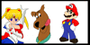
Remake of my all-time biggest piece --> fav.me/d3kw3dq
I remember last year when 10 layers was a lot for me, and I felt like a bad ass xD

96 Layers, 4-5 days of work
I know I said I wouldn't do it until after the PCs were over, but I just couldn't resist.. hope you guys could forgive me for that. Well, mainly Bixiff since yours is the only one I had on the list at the time I started this so I apologize and I'm currently working on your PC.
Well.. where do I start? xD
With Mario, I tried dozens of sketches of him. I couldn't make up my mind and I eventually went with this one. This is probably the best picture of Mario I've ever drawn.. no idea why, I just have problems drawing him xD In the previous RR, you could hardly see his body, mostly because of the perspective, but still. He looks pose-y here again, but a lot less cheesy. I like how I colored him and his kart.
With Luigi, I definitely think he looks awkward, but he still looks okay. In the previous, I got a lot of complaints on his shoe or foot being enlarged so I made an effort to avoid that. His bike was the hardest of all the bikes/kart to sketch for some reason lol.
With Boswer, I think he looks the worst") worse than the previous RR xD but he could have looks worse. Eh.. kinda don't feel like talking about him..
worse than the previous RR xD but he could have looks worse. Eh.. kinda don't feel like talking about him..
With Daisy, her kart was the longest to edit, but it was worth the time. The tires and the spokes might be screwed up dimension-wise.
With Peach, I think she looks the cutest along with the Mach bike. I really didn't want her posing like the previous RR.. her face was too large. I drew so many mach bikes but this one is probably the best.
With Yoshi, he was the quickest to edit, kart and body. He doesn't look too different from the previous, so not much to reiterate here xD
With Waluigi, I think he looks great. He looks more definable and his bike is the most detailed out of all the karts/bikes. He's still holding his signature bob-omb, but he actually looks like he's gonna use the darn thing xD
With Wario, I think he looks the second worst.. he and Bowser were close, I couldn't decide xD but.. eh.. he still looks a LOT better than the previous.
With the Background, what an improvement! It actually looks good! The previous looked horrendous, I hated it to death. It wasn't even shaded or anything. But I think this time around I finally got it right.
Hope you like and.. this really shows what a year of learning can do to you!
All characters and vehicles (c) Nintendo
Edit: edited my minor watermark
ReEdit (2014): Changed the size so it's easier on the eyes. After all these years, I'm still not happy with it -n- My style keeps changing and I keep getting better and I look back at stuff like this. Am I gonna redo it AGAIN?! ... Probably not for awhile at least.. I've learned that I can redo and redo pic after pic, but I'll never be happy with them as long as I keep improving. I can't win with redos and maybe that's just meant to be
I remember last year when 10 layers was a lot for me, and I felt like a bad ass xD
96 Layers, 4-5 days of work
I know I said I wouldn't do it until after the PCs were over, but I just couldn't resist.. hope you guys could forgive me for that. Well, mainly Bixiff since yours is the only one I had on the list at the time I started this so I apologize and I'm currently working on your PC.
Well.. where do I start? xD
With Mario, I tried dozens of sketches of him. I couldn't make up my mind and I eventually went with this one. This is probably the best picture of Mario I've ever drawn.. no idea why, I just have problems drawing him xD In the previous RR, you could hardly see his body, mostly because of the perspective, but still. He looks pose-y here again, but a lot less cheesy. I like how I colored him and his kart.
With Luigi, I definitely think he looks awkward, but he still looks okay. In the previous, I got a lot of complaints on his shoe or foot being enlarged so I made an effort to avoid that. His bike was the hardest of all the bikes/kart to sketch for some reason lol.
With Boswer, I think he looks the worst
With Daisy, her kart was the longest to edit, but it was worth the time. The tires and the spokes might be screwed up
With Peach, I think she looks the cutest along with the Mach bike. I really didn't want her posing like the previous RR.. her face was too large. I drew so many mach bikes but this one is probably the best.
With Yoshi, he was the quickest to edit, kart and body. He doesn't look too different from the previous, so not much to reiterate here xD
With Waluigi, I think he looks great. He looks more definable and his bike is the most detailed out of all the karts/bikes. He's still holding his signature bob-omb, but he actually looks like he's gonna use the darn thing xD
With Wario, I think he looks the second worst.. he and Bowser were close, I couldn't decide xD but.. eh.. he still looks a LOT better than the previous.
With the Background, what an improvement! It actually looks good! The previous looked horrendous, I hated it to death. It wasn't even shaded or anything. But I think this time around I finally got it right.
Hope you like and.. this really shows what a year of learning can do to you!
All characters and vehicles (c) Nintendo
Edit: edited my minor watermark
ReEdit (2014): Changed the size so it's easier on the eyes. After all these years, I'm still not happy with it -n- My style keeps changing and I keep getting better and I look back at stuff like this. Am I gonna redo it AGAIN?! ... Probably not for awhile at least.. I've learned that I can redo and redo pic after pic, but I'll never be happy with them as long as I keep improving. I can't win with redos and maybe that's just meant to be
Image size
2500x1786px 5.19 MB
© 2012 - 2024 HamSamwich
Comments150
This is amazing! It's an improvement on your last one. The colors are so vibrant! You've blended them well, too. You pretty much captured how you hate everyone who makes the who overcomes that gap between the bridges with Daisy's expression. I also have to give you kudos for the shading. To me, that's the hardest part of coloring a picture, especially if you don't know what you're doing (but to me, it seems you do). You've really captured the way the course looks, especially once you look at the background. Before I really got a good look at this picture, I could tell it was Rainbow Road. I love how out of everyone, Mario is just like "Hey, no panicking here, I'm all smiles."
I think this will inspire someone to thinks they want to stop drawing to continue drawing, and to someone who doesn't draw and wants to learn to draw to start drawing.
The starbits look like they came right from Super Mario Galaxy.
Wario looks like a kid with a mustache <img src="e.deviantart.net/emoticons/x/x…" width="15" height="15" alt="
So, long critique short, you did really good with the colors and the shading. This is just an example of how art can come out perfect if you take a long time to do it.
Comments have been disabled for this deviation